Blog 4- Color, Light, and Shadow
The reading this week from Color Studies book is about Dimensions of Color. The four different dimensions are hue, value, intensity, and temperature. We talked about very similar concepts during class as well, relating specifically to paint.
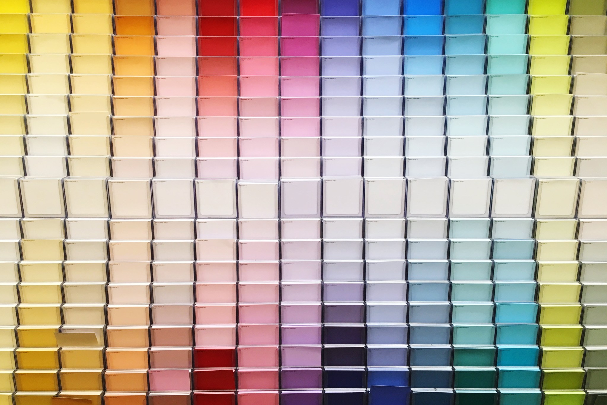
Chapter 6 is about the Dimensions of Hue. A pure hue means that nothing is added, no white, black, grey, or complementary color.
Mixing hues creates new hues, often starting with primary and resulting in secondary. However, there are two more ways in which hues can be mixed, which is two adjacent colors and two complementary colors. All of these can be equal or unequal proportions (this is called a broken hue).
The most dominant hue is called the tonality of the color or artwork it is used in. Primary hues in particular are viewed as stable and have great contrast.
Chapter 7 is about Dimensions of Value. Value refers to the lightness or darkness of a hue. Values can be changed by black and white creating different tints and shades.
Pure hues have different values as well, yellow being lighter and violet being darker. Middle grey value is in the center of all hues.
Discord is when the value of a hue is opposite to its natural order. Light discords being what provide highlights.
Value helps to create spatial clarity by using the art of shading. Shading can be broken down into different values called highlights, lights, shadows, core of shadows, reflected lights, and cast shadows.
Value can also create patterns and textures, affect our emotions, show definition and emphasis, and contrast and toning.
Light values tend to blend together in compositions, along with analogous hues. Equal values cause dissolving boundaries, while disappearing boundaries are a result of similarly colored hues.
When colors or shades of grey are sequenced within a composition, order is achieved, and imposing order can achieve harmony. There are different types of order, such as architectural and typographical order.
Chapter 8 ia about the Dimension of Intensity. Intensity, or saturation, defines how bright or dull a hue is.
Another term for saturation is called “chroma”. Pure hues have full chroma, but they can all differ in chroma strength. For example, red chroma is stronger than that of green chroma.
Greys can be added to dull pure hues, and when it is the same value as that hue, it is referred to as a colored grey.
When you add a complementary hue, it turns duller, creating a shade. All of these can be reated on an intensity scale.
Glazing is layering transparent complementary hues. These compositions are not as intense in color but are great for shading which results in depth and creating balance.
Lastly, chapter 9 is about the Dimension of Temperature. Temperature refers to the warmth of coolness of a color. Warm colors, such as red or yellow are associated with being hot.
Cool colors, such as blue or blue-green are associated with being cold. Mixing colors and surrounding hues can affect a color’s temperature.
In a composition, we must proportion the two temperatures because they affect how we see and feel about the artwork.
Temperature is very important when it comes to metals. This often depends on the quality of metal and its surroundings. Gold, a more valuable metal, is usually viewed as warm, whereas silver, that is not as valuable, is considered a cooler metal.
Sketching Interiors Chapter 4 is about Perception of Light and Shadow. These perceptions help to create three-dimensional space and distance.
The first key concept to go with this is value, which as we previously discussed is about brightness and darkness. Another important aspect to this is the tones of light, pale light tone is high light whereas dark tones are low light.
The different types of light/shadows that can be created are highlight, cast shadow, crest shadow, and reflected light. Highlight is the brightest the source falling directly on the object. Cast shadow is when the object blocks the light causing the darkest shadows. A crest shadow is between a highlight and reflected light, it is hard to distinguish, but helps objects to appear rounder. Reflected light is when light bounces back onto the object.
When drawing shadows, you can either shade or crosshatch. In addition, you should draw based off the surfaces and not the forms, this way you will not simply draw outlines but rather define forms. Next, make sure to leave some white in your composition, this will help your image to come alive. Along with that, is creating contrast especially in your main object, this shows depth and creates three-dimensional forms.


Sami,
ReplyDeleteThis Blog post was outstanding. Your summary of all the material we covered was interesting and comprehensive. Your sketch was well done. I also appreciated the images you added this week.
Total points 50/50
Your blog was very good! You had a ton of info and your sketch was very well done!
ReplyDelete